

END BAD DESIGN: This Week – The Folks at Little Jacket Design

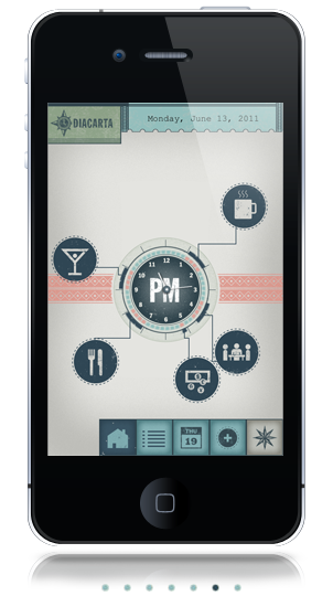
Little Jacket is a design agency based in Cleveland and New York that is getting lots of buzz lately because of their beautiful Diacarta iPhone app, which they used to power Pitchfork Music Festival’s iPhone guide.


I decided to get in touch with the agency to tap some design wisdom, and they thought it would be fun to have a bunch of employees respond. Soak it up, friends!
1. Ken Hejduk (Partner)
Tell us a bit about who you are and the work you do:
I am a designer and a creative problem solver. I make stuff and think really hard about things for our clients.
What is your go-to font or font combination as of late?
Hand done type with more hand done type. But it has to be executed well.
Why do you like that combination?
Because it likely has its own personality. Unless you are biting someone else’s style.
What font do you think is overused and about to go out of style?
Hellenic and Cyclone.
What do you wish you could tell new designers to quit doing?
Stop trying to make your work overly complicated no matter what rationale you can provide for the concept.
What’s the next trend?
Anything new that appears on ffffound more than three days in a row.
Which trend is about to be over?
Overdone useless Infographics.
What designer do you want to turn our readers on to?
I never know how to answer this. It seems like with the internet and all, most designers know the who’s who of the design world. That said, I think you should check out [fellow partner] Joey’s illustration/drawing.
2. Roger Frank (partner at Little Jacket):
Tell us a bit about who you are and the work you do:
I’m the writer/creative director who gets to work with a lot of gifted designers.
What is my go-to font?
I think I know a lot about design. And then you ask me this. Hmm.
What font do you think is overused and about to go out of style?
I think great classic fonts never go out of style. I think trendy stupid fonts go out of style. But not as fast as I would like them to.
What do you wish you could tell new designers to quit doing?
Stop trying so hard. Look at the brief. Look at the brand. Simplify and execute.
What’s the next trend?
Hand done type will continue to be big. People are just starved for craft and are sick of all the average crap being turned out.
Which trend is about to be over?
I think Ken got it right.
What designer do you want to turn our readers onto?
[Fellow employees] Ken Hejduk, Andy Hendricks and Christian Woltman. Because I work with them everyday and if they get more work I get more work and I love to work. We have the best jobs.
3. Andy Hendricks (designer at Little Jacket)
Tell us a bit about who you are and the work you do:
I’m Andy Hendricks (designer). I enjoy fun, smart, and clever design solutions. Appropriateness is important. Concept usually drives the visual solutions.
What is your go-to font or font combination as of late?
It obviously depends on what the project is, but I do enjoy Trade Gothic Bold Condensed #20 paired with a script font. Also, I’ve currently been digging Sign Painter and just about any face of Knockout [see Tangential logo!] can look really good.


Why do you like that combination?
It seems to have a slightly humorous and friendly tone.
What font do you think is overused and about to go out of style?
I’m not sure what fonts are overused, but I could sure go without hearing any more comic sans jokes. For real.
What do you wish you could tell new designers to quit doing?
Quit trying to be a rock star, and be more of a team player. Build relationships. Just be yourself. etc.
What’s the next trend?
More cats. Or Tye-Dye everything.
Which trend is about to be over?
Pretty soon we won’t even need design. Everything will soon be created by Apple and transmitted through giant iPad jumbo-trons.
What designer do you want to turn our readers on to?
Mikey Burton
Joey Parlett
4. Christian Woltman (designer)
Tell us about who you are and the work you do:
I’m a designer at Little Jacket in the great Cleveland, Ohio. On any given day I’m designing or concepting projects for print, web and some of that new digital mumbo jumbo. In the evening hours I work on side projects or the occasional freelance gig. Lately I’ve been trying to develop my illustration skills. I really enjoy the problem solving that goes into editorial illustration.
Here are some snippets of recent projects at Little Jacket.
The Ramble (Biltmore Forest): Logo concept/brand element for The Ramble neighborhood in Asheville, North Carolina. This project was a Little Jacket/SCALE collaboration.

Open Doors Academy Kickball/Dodgeball Tournament: Promotional item for a yearly fundraiser. These actually got letter pressed onto a red sticker paper with the dodgeball texture. Sooo pretty in person, sorry internet!

Go to Font:
This depends on the project. I’m constantly referencing design and styles from the past trying to bridge the gap between old and new. Some typefaces have that old/new sweet spot built right in, Gotham is one that comes to mind.
Font Combo:
Gotham has that “working man” feel to it. It looks great locked up with a logo and it would be even more beautiful painted on the side of a building (one of my dream projects!).
Overused Font:
This isn’t necessarily a particular font, but a type of style floating around where designers are using extra condensed faces. I think it’s a great idea if it makes sense, but sometimes it feels over used and unnecessary.
New designers:
Dear new designer guy/girl, don’t sensor yourself. If you feel the drive to create something-do it! Make things and make them amazing. Don’t ever tell yourself you can’t learn something new everyday. This has been one of the biggest hurdles of my career, I’m learning to not quit everyday.
Next trend:
The next trend is anything and everything. That might be a lame answer. With the internet the possibility of trends and inspiration are endless. Personally, I hope the next trend is smarter problem solving all around.
Trend that’s about to be over:
Hmm, how about all those ‘X’ logos. Didn’t Mikey Burton do the first one back in college? Regardless, it’s a good design device.
What designer do you want to turn readers on to?
Not too many people have been introduced to Mo Lebowitz. He’s a fantastic designer that’s been rocking the letterpress since the 1960s. I’m actually in the beginning stages of developing an archive website for Mo in hopes of bringing his work to a much broader audience. The site should be up and running sometime around the end of this year.
5. Jordan Kasten-Krause (Intern)
Tell us a bit about who you are and the work you do:
I am a Visual and Communication and Design major at Kent State University and currently interning with Little Jacket. My work rangers from print to interactive design. As someone who is new to the design world, I am always actively in search of fresh and innovative way to communicate concepts to an audience.
What is your go-to font or font combination as of late?
Being a student, I try to avoid using the the same font repeatedly, but I am have always been partial to script fonts such as Semilla by Sudtipos. As for font combinations, I enjoy using slab serifs and san serifs together.


Why do you like that combination?
The two have similarities in structure and form, but still provide a level of contrast.
What font do you think is overused and about to go out of style?
There are plenty of fonts that may be considered overused such as Gotham or Archer; however, I don’t think they will go out of style anytime soon.
What do you wish you could tell new designers to quit doing?
Don’t settle for producing mundane work. Take risks when you have the opportunity and don’t be afraid to fail once in awhile.
What’s the next trend?
Hand made/self created typography such as the work Jessica Hische and Chris Piascik.
Which trend is about to be over?
Its hard to predict the future of trends especially in the design community, although I think the use of condensed and inline type will start to diminish in popularity in the near future.
What designer do you want to turn our readers on to?
6. Joey Parlett (partner/ designer/ creative)
Tell us a bit about who you are and the work you do:
I design and make drawings. On any given day I could be making animations, murals, spot illustrations, designing corporate graphics or spending too much time on the internet.
What is your go-to font or font combination as of late?
I really like Archer these days. In combination with some hand drawn type. I realize this isn’t the edgiest font but its reliable.
Why do you like that combination?
Something like Archer is friendly and has some authority without any pretentiousness. then you can have some fun with a hand drawn element.
What font do you think is overused and about to go out of style?
I’ve always wanted to use something like Hobo in a sophisticated way. It might be impossible though.
What do you wish you could tell new designers to quit doing?
Quit spending so much time on the internet and make something.
What’s the next trend?
App zines. As soon as self publishing apps gets simplified. Also…maybe more designers learning how to draw. There has got to be a balance to the mass amounts of time on the computer.
Which trend is about to be over?
This might be a cop-out but there are so many fractions of the creative spectrum that I find it difficult to say whats over. Maybe dormant till it resurfaces. When is that David Carson type of thing going to resurface?
What designer do you want to turn our readers on to?
Leanna Shapton
Well….she’s more of an illustrator but her hand drawn type is simple and sophisticated. I keep her in mind when i want to make things complicated.
This woman is really hilarious: Jennifer Daniel
And Forest is cool, a little on the artsier side of the spectrum
Finally, Mikey Burton’s good buddy Dan Blackman makes great work.
End Bad Design began when Becky realized she had learned a lot more about design from sitting next to a designer at work than from reading any book explaining what ascenders and descenders are. END BAD DESIGN is her attempt to give everyone that access to designer opinions.
Former editions: