Chris Larson, Aveda

Tell us a little about yourself:
I am a graphic designer and art director who gets a lot more done now that I live in St. Paul. Some things that inspire me right now are Oreos, superheros, Harper’s Baazar from the late 50s, Grandmaster Flash, Edward Gorey, synthesizers and Muppets (Kermit the Frog and Bert & Ernie in particular).
I currently work at Aveda headquarters, concepting photo shoots and designing collateral, but in my spare time I keep busy with side projects like art direction for Voltage: Fashion Amplified.
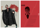
I’ve included a couple of Voltage images I’m proud of. (Above and below)

What is your go-to font or font combination as of late? Can you provide a screenshot?
I’m really into Giorgio Sans. I like to pair it with classic yet somewhat distinctive serifs, like Feijoa.

Why do you like that combination?
I like the syncopation created by the varying widths of the round characters in Giorgio Sans—It’s unexpected and fun, but also sleek. Feijoa is a nice counterpoint, I think it keeps things from getting too Eurotrashy. (The operative word is too).
What font do you think is overused and about to go out of style?
I have to say that I love Hoefler & Frere-Jones (as well as Martha Stewart, whose magazine the offending typeface was commissioned for), but I feel like Archer has had the crap beaten out of it in the last couple of years. It’s a little bit like discovering your favorite donut of ever and then realizing you can’t just eat donuts all the damn time. She’s a great font, but let’s let her catch her breath, ok guys?
What do you wish you could tell new designers to quit doing?
Gathering inspiration only from design magazines or Flickr accounts. Draw inspiration from your experiences! My advice is to go out on a Saturday night—somewhere where there’s lots of people—and get very drunk. Take a picture of the weirdest person you meet. When your hangover subsides and you find the picture, design something the way you think that creeper would design it if they knew what to do with creative suite.
What’s the next trend?
I suspect yin-yangs are due for a comeback. And geckos.
Which trend is about to be over?
Very tired of twee rock posters.
What designer do you want to turn our readers on to?
Alvin Lustig is wonderful. I think people gravitate to him at the surface right now because there’s an identifiable mid-mod style going on, which is lovely. My parents gave me a monograph of his work for Christmas (hi Mom!) and I’ve come to dig his book covers not just for that signature style, but also because he captures the concept of the book so succinctly on the cover—without pandering.
Bonus: I’ll never get over Alexey Brodovitch. He can’t be beat if you’re interested in magazine/editorial design. They say he would frequently bark “Astound me!” at his students/subordinates. Schwing!
Thanks Chris!
Becky Lang has learned a lot more about design from sitting next to a designer at work than from reading any book explaining what ascenders and descenders are. END BAD DESIGN is her attempt to give everyone that access to designer opinions.
Former editions:
Leave a Reply